Differences Between AWT and Swing
Even the simplest Swing components have capabilities far beyond what the AWT components offer:
Another interesting feature is that Swing components
with state use models to keep the state. A JSlider, for
instance, uses a BoundedRangeModel object
to hold its current value and range of legal values. Models are set
up automatically, so you don't have to deal
with them unless you want to take advantage of the power they can
give you.
If you're used to using AWT components, you need to be aware of a few gotchas when using Swing components:
When a Swing GUI needs to paint itself -- whether for the first time, in response to becoming unhidden, or because it needs to reflect a change in the program's state -- it starts with the highest component that needs to be repainted and works its way down the containment hierarchy. This process is orchestrated by the AWT painting system, and made more efficient and smooth by the Swing repaint manager and double-buffering code.
Swing components generally repaint themselves whenever necessary. When you invoke the setText method on a component, for example, the component should automatically repaint itself and, if appropriate, resize itself. If it doesn't, it's a bug. The workaround is to invoke the repaint method on the component to request that the component be scheduled for painting. If the component's size or position needs to change but doesn't do so automatically, you should invoke revalidate upon the component before invoking repaint.
Like event-handling code, painting code executes on the event-dispatching thread. While an event is being handled, no painting will occur. Similarly, if a painting operation takes a long time, no events will be handled during that time.
For smoothness, Swing painting is double-buffered
by default -- performed to an offscreen buffer and then flushed to the
screen once finished. It might slightly help performance if you make a
Swing component opaque, so that the Swing painting system can know
not to paint anything behind the component. To make a Swing component opaque,
invoke setOpaque(true) on the component.
The Single-Thread Rule : Once a Swing component has been realized, all code that might affect or depend on the state of that component should be executed in the event-dispatching thread.
Realized: A Swing component that's a top-level window
is realized by having one of these methods invoked on it:
setVisible(true), show, or pack. Once a window is realized,
all the components that it contains are realized.
Another way to realize a component is to add it to a container that's
already realized.
Two JComponent methods are safe to call from any thread: repaint
and revalidate.
These methods queue requests to be executed on the event-dispatching
thread.
Also, it's always safe to call the addListenerTypeListener and removeListenerTypeListener
methods.
The add/remove operations have no effect on an event dispatch that's
under way.
The SwingUtilities class provides two methods to help you run code in the event-dispatching thread:
invokeLater
Requests that
some code be executed in the event-dispatching thread. This method returns
immediately,
without waiting
for the code to execute.
invokeAndWait
Acts like invokeLater,
except that this method waits for the code to execute. As a rule, you should
use
invokeLater
rather than this method.
JComponent : All non-top level swing components starting with
J are subclass of JComponent class. It provides features like tooltip text,
border, configurable L&F, Double Buffering etc.
Icons : Swing components such as JButton and JLabel can have
images represented by Icon Objects.
Actions : If you want multiple objects to share state and data
information during action event, use Action objects.
Pluggable Look and Feel : A Single program can have any one
of several L&F. It can be chosen by the end user or set programmatically
set.
Support Assistive Technologies: Swing API comes with in built
support for Assistive Technologies.
Separate Data and State Models: All noncontainer Swing Components
have a underlying model. JButton has a ButtonModel which
stores information like - Keyboard Mnemonic, enabled state or not, selected,
pressed and so.
Some Swing Component can have more than one underlying models. For
example JList has ListModel which contains the List's contents
and ListSelectionModel which contains information about its list
selection.
Working with models directly is more efficient and faster.
The JComponent class extends java.awt.Container class. There are some classes like Box.Filler which are not top-level container and that do not subclass JComponent.
Important methods include : setToolTipText, setBorder, registerKeyboardAction(specify a KeyStroke Object), putClientProperty, getClientProperty (properties for use by Layout Managers), setPreferredSize, setMinimumSize, setMaximumSize, setAlignmentX, setAlignmentY (setter methods: Component class provides getter methods), setOpaque, isOpaque etc
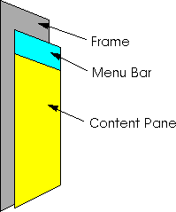
Each top-level container has a containment hierarchy of its own.
Top-Level container has a content-pane that contains all the visible components of the top-level container. It is an intermediate container that inherits from JComponent class with a BorderLayout layout Manager. getContentPane returns a Container object and not a JComponent object. Generally an opaque JComponent , such as JPanel, is constructed to contain all the visible components and set as the content pane with setContentPane.
In theory all top-level container can have a JMenuBar. But generally a JFrame or a JApplet has JMenuBar. Use setJMenuBar.
All top-level container has a RootPane that supports the content pane,
menubar, Layered pane and Glass Pane.
It is used to intercept mouse click or paint over multiple components.
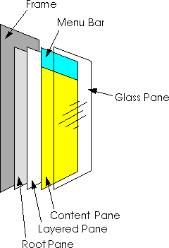
The layered pane directly contains the menu bar and content pane, and enables Z-ordering of other components you might add. The glass pane is often used to intercept input events occurring over the top-level container, and can also be used to paint over multiple components.
JFrame extends from java.awt.Frame.
By default, when the user closes a frame onscreen,
the frame is hidden. Although invisible, the frame still exists and
the program can make it visible again. If
you want different behavior, then you need to either register a window
listener that handles window-closing events,
or you need to specify default close behavior using the
setDefaultCloseOperation method. You
can even do both.
The argument to setDefaultCloseOperation must
be one of the following values, which are defined in the
WindowConstants interface (which JFrame
implements):
API: createRootPane, setRootPane, getRootPane, getGlassPane, setGlassPane, setLayeredPane, getLayeredPane, setContentPane, getContentPane, setJMenuBar, getJMenuBar, setDefaultCloseOperation etc
Extends the java.awt.Dialog class.
Every dialog is dependent on a frame. When
that frame is destroyed, so are its dependent dialogs. When the
frame is iconified, its dependent dialogs
disappear from the screen. When the frame is deiconified, its dependent
dialogs return to the screen. The AWT automatically
provides this behavior.
A dialog can be modal. When a modal dialog
is visible, it blocks user input to all other windows in the program.
The dialogs that JOptionPane
provides are modal. To create a non-modal dialog, you must use the JDialog
class directly.
It is a container that automatically creates a JDialog and put itself to the contentpane of the JDialog. It is Modal.
JOptionPane's icon support lets you easily
specify which icon the dialog displays. You can use a custom icon, no
icon at all, or any one of four standard JOptionPane
icons (question, information, warning, and error). Each look
and feel has its own versions of the four
standard icons.
JOptionPane API:
| Method | Purpose |
| int showMessageDialog(Component, Object)
int showMessageDialog(Component, Object, String, int) int showMessageDialog(Component, Object, String, int, Icon) |
Show a one-button, modal dialog that gives the user some information. The arguments specify (in order) the parent component, message, title, message type, and icon for the dialog. |
| int showOptionDialog(Component, Object, String, int, int,Icon, Object[], Object | Show a customized modal dialog. The arguments specify (in order) the parent component, message, title, option type, message type, icon, options, and initial value for the dialog. |
| int showConfirmDialog(Component, Object)
int showConfirmDialog(Component, Object, String, int) int showConfirmDialog(Component, Object, String, int, int) int showConfirmDialog(Component, Object, String, int, int, Icon) |
A modal dialog that ask the user a question. The arguments specify (in order) the parent component, message, title, message type, and icon for the dialog. |
| String showInputDialog(Object)
String showInputDialog(Component, Object) String showInputDialog(Component, Object, String, int) String showInputDialog(Component, Object, String, int, Icon, Object[], Object) |
Show a modal dialog that prompts the user for input. The single-argument version specifies just the message, with the parent component assumed to be null. The arguments for the other versions specify (in order) the parent component, message, title, message type, icon, options, and initial value for the dialog |
Description of arguments in the above methods:
Component parentComponent
The first argument
to each showXxxDialog method is always the parent component, which must
be a
frame, a component
inside a frame, or null. If you specify a frame, then the dialog will appear
over the
center of the
frame, and depend on that frame. If you specify a component inside a frame,
then the dialog
will appear
over the center of that component, and depend on that component's frame.
If you specify null,
then the look
and feel picks an appropriate position for the dialog -- generally the
center of the screen, and
the dialog doesn't
depend on any visible frame.
The JOptionPane
constructors do not include this argument. Instead, you specify the parent
frame when
you create the
JDialog that contains the JOptionPane, and you use the JDialog
setLocationRelativeTo
method to set the dialog's position.
Object message
This required
argument specifies what the dialog should display in its main area. Generally,
you specify a
string, which
results the dialog displaying a label with the specified text. You can
split the message over
several lines
by putting newline (\n) characters inside the message string. For example:
"Complete the sentence:\n \"Green eggs and...\""
String title
The title of
the dialog.
int optionType
Specifies the
set of buttons that appear at the bottom of the dialog. Choose from one
of the following
standard sets:
DEFAULT_OPTION, YES_NO_OPTION, YES_NO_CANCEL_OPTION,
OK_CANCEL_OPTION.
int messageType
This argument
determines the icon displayed in the dialog. Choose from one of the following
values:
PLAIN_MESSAGE
(no icon), ERROR_MESSAGE, INFORMATION_MESSAGE,
WARNING_MESSAGE,
QUESTION_MESSAGE.
Icon icon
The icon to
display in the dialog.
Object[] options
Further specifies
the option buttons to appear at the buttom of the dialog. Generally, you
specify an array of
strings for
the buttons. See Customizing Button Text in a Standard Dialog for more
information.
Object initialValue
Specifies the
default value to be selected.
Knowing User's Response:
The showMessageDialog, showConfirmDialog, and showOptionDialog methods return an integer indicating the user's choice. The values for this integer are YES_OPTION, NO_OPTION, CANCEL_OPTION, OK_OPTION, and CLOSED_OPTION. Except for CLOSED_OPTION, each option corresponds to the button the user pressed. When CLOSED_OPTION is returned, it indicates that the user closed the dialog window explicitly, rather than by choosing a button inside the option pane.
Customized Dialog:
1. Create a JOptionPane like ... new JOptionPane(mesg,optionType, OptionType)
2. Create a JDialog
3. set the JOptionPane of step1 as the contentPane of the JDialog of
step2
4. To override the default behaviour of a JOptionPane getting closed
as the user chooses an option, register a PropertyChageListener to the
JDialog. Get propertyName and handle it according to your requirments.
If the browser is Swing enabled an html file with <APPLET>tag can
be used to run an applet. If the browser does not support swing, java plug-in
must be used and the applet should be specified using <OBJECT> tag ot
<EMBED> tag. There are tools that generates this new tags from <APPLET>
tag.
Intermediate Swing Containers:
DeskTop Pane is a specialized Layered Pane intermediate container that is used to contain JInternalFrame.
JPanel Class
The Layout manager can be specified at instantiation time as an argument
to the constructor or by using the setLayout method.
You can change a scroll pane's client dynamically by calling the setViewportView
method. Note that
JScrollPane has no corresponding getViewportView method, so
you should cache the client object in a
variable if you need to refer to it later.
JScrollPane uses an instance of JViewPort to manage its visible
region. It uses instances of JScrollBar to manage scrolling.
ScrollPane policy
The scroll bar policy of the horizontal and vertical scroll bars can
be specified at creation time or set dynamically:
JScrollPane(Component, vertPolicy, horiPolicy)
JScrollPane(vertPolicy, horiPolicy)
OR
setHorizontalScrollBarPolicy(int)
setVerticalScrollBarPolicy(int)
In above the int values can be one of the following constants defined
in the ScrollPaneConstants Interface:
VERTICAL_SCROLLBAR_AS_NEEDED, HORIZONTAL_SCROLLBAR_AS_NEEDED, VERTICAL_SCROLLBAR_ALWAYS,
HORIZONTAL_SCROLLBAR_ALWAYS, VERTICAL_SCROLLBAR_NEVER, HORIZONTAL_SCROLLBAR_NEVER
Custom Decorations
The area drawn by a scroll pane consists of up to nine parts: the center,
four sides, and four corners. The center is
the only component that is always present in all scroll panes. Besides
scroll bars, the sides can contain column and
row headers. A corner component is visible only if both sides that
intersect at that corner contain visible
components.
API: setColumnHeaderView(Component), setRowHeaderView(Component), setCorner(JScrollPane.XXX_XXX_CORNER, Component)
Scroll-Savvy Client
To customize the way that a client component interacts with its scroll
pane, you can make the component
implement the Scrollable interface. By implementing Scrollable,
a client can specify both the size of the
viewport used to view it and the amount to scroll for clicks on the
different controls on a scroll bar.
The Scrollable interface includes the following methods:
Lists, Tables, textComponents, and trees implements the scrollable interface.
Sizing the Scroll Pane
By default the size of a scroll pane is the preferred size of it nine
components.
If the size of the client is fized then having a scroll pane is redundant.
To get the scroll bars, in such as case, is to set the preferred size of
the scroll pane or its container.
Scroll-savvy clients implements Scrollable interface and provides methods
that the scroll pane uses to determine it scrolling behaviour. Scroll-savvy
class like lists, tables provides methods the programmer can call to set
the values returned by the methods of the Scrollable interface.
Dynamically Changing Client's Size
Step 1. Reset the preferred size of the client
Step 2. revalidate the client
API: setViewportView, setViewportBorder etc
Scrolling methods in other class : setVisibleRowCount (JList, JTree),
setPreferredScrollableViewportSize (JTable) etc.
JSplitPane([orientation],[boolean],[component1,component2])
orientation : JSplitPane.HORIZONTAL_SPLIT, JSplitPane.VERTICAL_SPLIT
boolean : Determines whether the component repaints as the user drags
the split pane.
setOneTouchExpandable, setDividerSize, setDividerLocation, setOrientation,
setLeftComponent, setRightComponent, setTopComponent, setBottomComponent
JTabbedPane([int]) : The int specfies constants from SwingConstants
interface
: TOP, BOTTOM, LEFT, RIGHT
addTab(TabLabelText, [Icon], component,[toolTipText]), setSelectedIndex(int)
-- index starts from 0
It uses BoxLayout as its layout manager and hence can have its components call setAlignmentX, setAlignmentY etc.
API: JToolBar(), add(Component), add(Action), addSeparatot(),
setFloatable(boolean) etc
The internal frame is implemented with platform-independent code and hence has more features than normal frames. It can specify the window decorations for resizing, iconifying, and maximizing. Internal frames cannot be root of a containment hierarchy. It does not generate windows event and generates Internal Frame events. Internal frame supports root pane and hence realizing GUI in internal frame is similar to that of normal frame.
Important rules while using internal frames:
- It is usually contained in a LayeredPane as JDeskTopPane.
- By default the internal frame has 0 size and must be set using pack,
setSize or setBounds
- set the location in within its container using setLocation
or setBounds
- to add components to an internal frame add it to the content
pane of the internal frame
- to allow just outline drawing at the time of dragging use : internalframecontainer.setClientProperty("JDesktopPane.fragMode",
"outline")
API: setJMenuBar, setDefaultCloseOperation, addInternalFrameListener,
moveToFront, moveToBack etc
All containers with root pane supports a JLayeredPane.
There are 2 main classes of Layered Pane : JLayeredPane and its sublcass
JDesktopPane.
A Layered Pane does not have default layout manager. This is because all existing managers lays out components as if all of them are in a single layer.
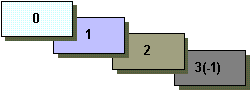
Depth: The higher the value higher the depth.
Position: The higher the value lower the depth with the same layer.
If there are n components in a layer, the position ranges from 0 to n-1.
-1 is same as n-1. For example when n=3 we have:
API: JLayeredPane(), add(Component,[depthasInteger],[positioninsamelayerasInt]), setLayer(Component, depthasInt, [positionasInt]), setPosition(Component, positionasInt), moveToFront(Component), moveToBack(Component) etc
If in add method depth is not specified it is assumed to be 0. If position
is not specified then it is same n-1.
The setPosition and moveTo.. are methods for the same layer.
The JRootPane uses a JLayeredPane instance:
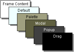
The description of each of this layers are shown below:
| Layer Name | Value | Description |
| FRAME_CONTENT_LAYER | new Integer(-30000) | This layer is used to position the frame's content pane and
menu bar. Most programs won't use this. The root pane adds the menu bar and content pane to its layered pane at this depth. |
| DEFAULT_LAYER | new Integer(0) | Most components go in this layer. If you don't specify a
component's depth, the layered pane puts it at this depth. |
| PALETTE_LAYER | new Integer(100) | This layer is useful for floating toolbars and palettes. |
| MODAL_LAYER | new Integer(200) | Modal internal-frame dialogs would belong in this layer. |
| POPUP_LAYER | new Integer(300) | Popups go in this layer because they need to appear above
just about everything. |
| DRAG_LAYER | new Integer(400) | Move a component to this layer when dragging. Return the
component to its regular layer when dropped. |
All button classes are subclasses of AbstractButton. Different
buttons include : JButton, JCheckBox, JRadioButton, JMenuItem, JCheckBoxMenuItem,
JRadioButtonMenuItem, JToggleButton.
Generally buttons listen to Action Events while CheckBox listens to
Item Events. But selecting a CheckBox also genarates an ActionEvent.
Swing Buttons can have both text labels as well as image.
A button can be set as the default button of a top level container by calling the setDefaultButton method on the root pane of the top-level container. The text label of a JButton can be specified by using HTML.
JCheckBox
JCheckBox chkBox = new JCheckBox("TOP or BOTTOM", imageIcon);
chkBox.setMnemonic(KeyEvent.VK_C);
chkBox.setSelected(true);
chkBox.addItemListener(....)
JRadioButton
JRadioButton radBtn1 = new JRadioButton("radiobtn1", imageIcon1);
radbtn1.setMnemonic(KeyEvent.VK_R);
radBtn1.setSelected(true);
radBtn1.addActionListener(...)
JRadioButton radBtn2 = new JRadioButton("radiobtn2", imageIcon2);
radbtn2.setMnemonic(KeyEvent.VK_S);
radBtn2.addActionListener(...)
ButtonGroup rg = ButtonGroup()
rg.add(radBtn1);
rg.add(radBtn2);
API: setText, setIcon, setDisabledIcon, setPressedIcon, setSelectedIcon,
setHorizontalAlignmnet, setVerticalAlignment, setHorizontalTextPosition,
setVerticalTextPosition, doClick etc
The ColorChooser implements the ColorSelectionModel to which we can register a Change Event Listener in which we can get the selected color and do the needful:
tcc.getSelectionModel().addChangeListener(
new ChangeListener() {
public void stateChanged(ChangeEvent e) {
Color newColor = tcc.getColor();
banner.setForeground(newColor);
}
}
);
The chosen color is used to set the forground color of a label called
"banner".
The default renderer for JComboBox displays strings and icon. If objects
other than strings and icon are to be displayed then a custom renderer
must be set. The custom renderer must implement the ListCellRenderer interface.
This works for JList also.
If the JComboBox is an editable one then a custom editor which implements
ComboBoxEditor can be used.
API: JComboBox(Object[]), JComboBox(Vector), addItem(Object),
addItemAt(Object,int), getItemAt(int), getSelectedItem(), removeAllItems(),
removeItemAt(int), getItemCount(), setEditable(boolean), setRenderer(ListCellRenderer)
etc
Opening a file
JFileChooser fc = new JFileChooser("someDirectory"); // "someDirectory"
could be replaced by a File Object
int sel = fc.showOpenDialog(componentObj);
if (sel == JFileChooser.APPROVE_ACTION) {
File selFile = fc.getSelectedFile();
...
} else {
// sel == JFileChooser.CANCEL_OPTION
....
}
API: setCurrentDirectory, showSaveDialog, etc
Constructor : JLabel([textString],[icon],[horizonAlign]) : Here horizontal alignment is any of the SwingConstants - LEFT, CENTER, RIGHT, LEADING, TRAILING.
other API: setText, setIcon, setVerticalAlignment, setHorizontalAlignment,
setVerticalTextPosition, setHorizontalTextPosition, setLabelFor(component)
etc
Constructor :
JList(Vector) , JList(Object[]) : creates a list whose listmodel is
immutable and hence new elements cannot be added, removed or replaced.
JList(ListModel) : allows to create a list with the specified ListModel
which can be Immutable, say DefaultListModel. Such a list can have
its element removed, replaced or added after creation. Another way of changing
the model is by calling the setModel() method.
SelectionMode:
List uses an instance of ListSelectionModel to manage selection. By default the selection mode is MULTIPLE_INTERVAL_SELECTION. Other selection mode can be set by using setSelectioMode method. The argumements are constants from ListSelectionModel : SINGLE_SELECTION, SINGLE_INTERVAL_SELECTION.
List generates ListSelectionEvent which are handled by ListSelectionListener
that defines the ValueChanged method.
The ListSelectionListener is added to the list instance.
Adding, Removing and Inserting elements:
Add and insert elements to the list model using addElement
and insertElementAt methods.
Remove elements from the list instance using the remove(index)
method.
Custom Renderer:
Same as that of custom renderer in Combo box.
API: setSelectedIndex, setSelectedIndices, getSelectedIndex,
getSelectedIndices, getMinSelectedIndex, getMaxSelectedIndex, getSelectedValue,
getSelectedValues, getFirstVisibleIndex, getLastVisibleIndex, getVisibleRowCount,
setVisibleRowCVount etc
Here is a picture of the inheritance hierarchy for the menu-related classes:
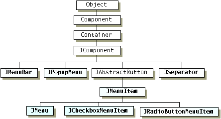
As the figure shows, menu items (including menus) are simply buttons.
You might be wondering how a menu, if it's
only a button, shows its menu items. The answer is that when a menu
is activated, it automatically brings up a
popup menu that displays the menu items.
Enabling Keyboard Operation:
Menus support two kinds of keyboard alternatives:
mnemonics and accelerators. Mnemonics offer a way to use
the keyboard to navigate the menu hierarchy,
increasing the accessibility of programs. Accelerators, on the other
hand, offer keyboard shortcuts to bypass navigating
the menu hierarchy. Mnemonics are for all users; accelerators
are for power users.
You can specify a mnemonic either when constructing
the menu item or with the setMnemonic method. To
specify an accelerator, use the setAccelerator
method. Here are examples of setting mnemonics and
accelerators:
//Setting the
mnemonic when constructing a menu item:
menuItem = new
JMenuItem("A text-only menu item",
KeyEvent.VK_T);
//Setting the
mnemonic after creation time:
menuItem.setMnemonic(KeyEvent.VK_T);
//Setting the
accelerator:
menuItem.setAccelerator(KeyStroke.getKeyStroke(
KeyEvent.VK_T, ActionEvent.ALT_MASK));
Popup Menu:
To bring up a popup menu ( JPopupMenu), you
must register a mouse listener on each component that the
popup menu should be associated with. The
mouse listener must detect user requests that the popup menu be
brought up.
The mouse listener brings up the popup menu by invoking
the show method on the appropriate JPopupMenu
instance. Example code:
//...where instance
variables are declared:
JPopupMenu popup;
//...where the GUI is constructed:
//Create the popup menu.
popup = new JPopupMenu();
menuItem = new JMenuItem("A popup menu item");
menuItem.addActionListener(this);
popup.add(menuItem);
menuItem = new JMenuItem("Another popup menu item");
menuItem.addActionListener(this);
popup.add(menuItem);
//Add listener to components that can bring up popup menus.
MouseListener popupListener = new PopupListener();
output.addMouseListener(popupListener);
menuBar.addMouseListener(popupListener);
...
class PopupListener
extends MouseAdapter {
public void mousePressed(MouseEvent e) {
maybeShowPopup(e);
}
public void mouseReleased(MouseEvent e) {
maybeShowPopup(e);
}
private void maybeShowPopup(MouseEvent e) {
if (e.isPopupTrigger()) {
popup.show(e.getComponent(),
e.getX(), e.getY());
}
}
}
Customizing Menu Layout:
The Menubar uses Horizontal BoxLayout and hence menus on it can be
customized by adding Box.createHorizontalGlue to it, so that some menus
are to the rightmost portion of the menubar.
Creating Simple Tables:
JTable(Object[][] rowData, Object[] columnNames)
JTable(vector rowData, vector columnNames)
The contructors create tables with the default table model and
has the following restrictions:
* All cells are editable
* All columns are of the same type - String
* Row data cannot be modified/added/removed dynamically
Adding a table to a container:
Tables are generally added to a JScrollPane in which the scroll pane
automatically adds the table header:
JScrollPane
scrollPane = new JScrollPane(table);
table.setPreferredScrollableViewportSize(new
Dimension(500, 70));
If some other container is used the table header should be explicitly
set:
container.setLayout(new
BorderLayout());
container.add(table.getTableHeader(),
BorderLayout.NORTH);
container.add(table,
BorderLayout.CENTER);
Setting the Initial width of a column:
TableColumn tc = table.getColumnModel().getColumn(2);
tc.setPreferredWidth(100);
The minimum, maximum and current width of a column can also be set.
The resize behaviour of columns can be set by using the method setAutoResizeMode(JTable.constants).
The constants
include : AUTO_RESIZE_SUBSEQUENT_COLUMNS , AUTO_RESIZE_NEXT_COLUMN,
AUTO_RESIZE_OFF.
Setting the Selection Model:
By default the selection model is multiple row selection over multiple
intervals. Cells or columns cannot be individually
selected.
The selection mode can be set as :
table.setSelectionMode(ListSelectionModel.SINGLE_SELECTION)
A listSelctionListener can be registered to the ListSelectionmodel of the table as in List:
ListSelectionModel lsm = table.getSelectionModel();
lsm.addListSelectionListener(new ListSelectionListener() {
public void valueChanged(ListSelectionEvent
e) {
ListSelectionModel m = (ListSelctionModel)
e.getSource();
if (m.isSelectionEmpty())
{
....
} else {
int selIndx
= m.getMinSelectedIndex();
}
}
});
A sample customized Table Model:
Generally table models are subclasses of AbstractTableModel.
Tables created using this table model :
* Stores it own row data
* The column type is determined by the class of the column
* Allows editing to all coumns 2 and greater
class MyTableModel extends
AbstractTableModel {
final String[] columnNames = ...//same as before...
final Object[][] data = ...//same as before...
public int getColumnCount() {
return columnNames.length;
}
public int getRowCount() {
return data.length;
}
public String getColumnName(int col) {
return columnNames[col];
}
public Object getValueAt(int row, int col) {
return data[row][col];
}
public Class getColumnClass(int c) {
return getValueAt(0, c).getClass();
}
/*
* Don't need to implement this method unless your table's
* editable.
*/
public boolean isCellEditable(int row, int col) {
//Note that the data/cell address is constant,
//no matter where the cell appears onscreen.
if (col < 2) {
return false;
} else {
return true;
}
}
/*
* Don't need to implement this method unless your table's
* data can change.
*/
public void setValueAt(Object value, int row, int col) {
...//debugging code not shown...
...//ugly class cast code for Integers not shown...
data[row][col] = value;
fireTableCellUpdated(row, col);
...//debugging code not shown...
}
...
Table model events for Data Changes:
The AbstractTableModel defines many methods that fires table model events
that are always recognized by the table.
This includes : fireTableCellUpdated, fireTableChanged, fireTableDataChanged,
fireTableRowsDeleted,
fireTableRowsInserted,fireTableRowsUpdated, and fireTableStructureChanged.
If the default table model is used we need to register a TableModelListener to the table model to check edits on cells:
public class SimpleTableDemo ... implements TableModelListener {
...
public SimpleTableDemo() {
...
model = table.getModel();
model.addTableModelListener(this);
...
}
public void tableChanged(TableModelEvent e) {
...
int row = e.getFirstRow();
int column = e.getColumn();
String columnName = model.getColumnName(column);
Object data = model.getValueAt(row, column);
...// Do something with the data...
}
...
}
Cell Renderer and Cell editors:
A single Cell Renderer is used to display cell values in all columns
that have the same data type.
Cell editor takes over the cell when editing starts.
For example all number column cells used a single instance of right-aligned
JLabel as a Cell Renderer. And it uses an
instance of a right-aligned JTextField as a cell editor.
Algorithm for choosing renderer and editor:
Both renderer and editor uses the following algorithm:
* check to see if a renderer is specified for that particular column.
if so use it.
* if no renderer is specified call getClassName() method on the model
* chose from the following default table the renderer. (this list can
be changed programmatically):
Boolean -- rendered with a check box.
Number -- rendered by a right-aligned label.
ImageIcon -- rendered by a centered label.
Object -- rendered by a label that displays the object's string value.
Validating User-Entered Text:
The cell editor can be used to validate user entry as the user enter
them (change validation) or after the user ends the
enrty (action validation). The following example sets up a change validated
text field editor for all columns whose data
type is Integer:
final WholeNumberField
integerField = new WholeNumberField(0, 5);
integerField.setHorizontalAlignment(WholeNumberField.RIGHT);
DefaultCellEditor
integerEditor =
new DefaultCellEditor(integerField) {
//Override DefaultCellEditor's getCellEditorValue method
//to return an Integer, not a String:
public Object getCellEditorValue() {
return new Integer(integerField.getValue());
}
};
table.setDefaultEditor(Integer.class,
integerEditor);
In above the class WholeNumberField is custom subclass of JTextField
that allows only digits to be entered.
Setting a Combo Box as a cell editor:
TableColumn tc = table.getColumnModel().getColumn(2);
tc.setCellEditor(new DefaultCellEditor(aComboBoxInstance));
The DefaultCellEditor, which implements the TableCellEditor, allows
only JComboBox, JCheckBox and JTextField to
be specified. If some other type of classes need to be sapecified as
the editor then you need to create a subclass of the
desired editor component and the subclass must implement the TableCellEditor
interface.
Custom Renderer:
Creating a custom renderer is as simple as subclassing the desired component
and implementing the TableCellRenderer
interface. The new renderer can be set as:
table.setDefaultRenderer(class, new customCellRenderer());
Cell specific renderers can also be provided.
Sorting and Manipulating tables:
Specialized tables or data manipulators can be used besides the data
model for data manipulation such as sorting.
(The tutorial provides TableMap and TableSorter classes).
The following diagram shows the hierarchy diagram of the text components:
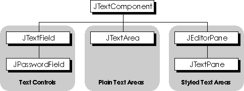
Plain Text areas can display/contain single font unformatted data. Styled Text Areas allows text of more than one font. JTextEditorPane allows text to be loaded from a preexisting file by using an URL.
Basic TextComponents:
JTextField:
JTextField textField = new JTextField(10);
textField.setActionCommand(textFieldString);
textField.addActionListener(this);
String str = textField.getText()
JPasswordField:
JPasswordField passwordField = new JPasswordField(10);
passwordField.setEchoChar('#');
passwordField.setActionCommand(passwordFieldString);
passwordField.addActionListener(this);
char[] pass = passwordField.getPassword();
Stores the field values as an array of characters and not as a string.
JTextArea:
JTextArea textArea = new JTextArea("...sone text...");
textArea.setFont(new Font("Serif", Font.ITALIC, 16));
textArea.setLineWrap(true);
textArea.setWrapStyleWord(true);
JEditorPane:
JEditorPane editorPane = new JEditorPane();
editorPane.setEditable(false);
...//create a URL object for the TextSamplerDemoHelp.html file...
try {
editorPane.setPage(url);
} catch (IOException e) {
System.err.println("Attempted to read a bad URL: " + url);
}
Basic Editor Pane supports : Plain Text, RTF, and HTML.
JTextPane:
Can specify various different paragraph and character format for different
texts in the same text pane.
JTextComponent : Concepts
JTextComponent provides to all components the following:
* A model called the document to handle the component's
content
* View
* Editor kit, that can read and write text and implements editing capabilities
with Actions
* Customizable keymaps and key bindings
* Infinite undo and redo
* Pluggable Caret and Caret change Listener
Document:
Document is the data model of the text component and it contains the
data of the component. The document hierarchy is:
AbstractDocument
(implements Document)
|
+--------+-------+
|
|
PlainDocument DefaultStyledDocument
(implements StyledDocument)
|
+
|
HTMLDocument
PlainDocument is the default for textfields, text areas ans text editor.
DefaultStyledDocument is the default document for text pane.
Documents can be customized ,say to limit the number of characters it
can contain. Important methods in customozation includes : insertString,
remove etc. setDocument from JTextComponent can be used to set te document.
A documentListener can listen to insert, remove or change in text format.
Do not try to update the text of a component from a document listener.
Editor Kits:
Supports editing commands such as copy, paste, cut, insert etc by using
Action object. Through its read and write methods, editor kit knows how
to read and write text of a particular format.
All action commands can be obtained by using the getActions
method of the JTextComponenet.The Actions can be associated with a GUI
component and/or KeyStroke.
Important editor kits include: DefaultEditorLit, StyledEditotKit, HTMLEditorKit,
RTFEditorKit.
KeyMaps:
Every text component has one or more keymaps-- each of which is an
instance of the Keymap class. A
keymap contains a collection of name-value pairs where the name is
a KeyStroke and the value is an
Action. Each pair binds the keystroke to the action such that when
the user types the keystroke, the
action occurs.
All text components has a default Keymap. This default can be modified
or enhanced.
Undo and Redo:
Two main steps are invloved:
1. Remembering Undoable edits
--> Create an instance of the UndoManager, say undo
--> Register an UndoableEditListener to the TextComponent. The
UndoableEditListener Remembers the edit and updates the GUI components
that control the undo and redo:
protected class MyUndoableEditListener
implements UndoableEditListener {
public void undoableEditHappened(UndoableEditEvent e) {
//Remember the edit and update the menus
undo.addEdit(e.getEdit());
undoAction.updateUndoState();
redoAction.updateRedoState();
}
}
In above, undoAction and redoAction are Action objects (subclass of AbstractAction) that corresponds to the GUI components for undo and redo.
2. Implementing the Undo and Redo commands for the GUI components:
The code for the UndoAction, ( which is set as the action of
the Redo MenuItem of a Menu), may look like:
public void actionPerformed(ActionEvent e)
{
try {
undo.undo();
} catch (CannotUndoException ex) {
System.out.println("Unable to undo: " + ex);
ex.printStackTrace();
}
updateUndoState();
redoAction.updateRedoState();
}
The code for RedoAction is analogous to that of the UndoAction.
Caret and Selection Listener:
A caret listener can be added to a text component to listen to caret
position and selection changes.
Using Text Fields:
To change-validate a textfield use a customized document and not a
document listener. This is because by the time the document listener is
called it is too late and the change has already been done.
Action validation is done in the action listener.
Document Listener:
Do not use documentListener for field validation but to listen to ,
and not interfere, with changes to the document's contents. DocumentListener
methods includes: insertUpdate, removeUpdate, changeUpdate etc
JComponent.setToolTipText("Hi this is a tool tip text");
If you are to set tool tip text to tabs of a tapped pane, specify it
in the addTab method.