| Actions: | Borders | ImageIcon |
| Look and Feel | Using Thread | Timer |
| Box Layout | GridBagLayout |
Actions:
Actions are ActionListener that are used to provide a centralized control
for multiple components in a ToolBar, Menu, PopupMenu. They are generally
created as a subclass of AbstractAction. Adding an Action into a Menu or
PopupMenu returns a MenuItem whereras adding it to a ToolBar returns a
Button. Icon and ToolTipText can be added to the returned components. If
the Action is disabled, all of the multiple components are also disabled.
Example of creating an Action:
leftAction = new AbstractAction("Go
left", new ImageIcon("images/left.gif")) {
public void actionPerformed(ActionEvent e) {
displayResult("Action for first button/menu item", e);
}
};
API : setEnabled(boolean), MenuItem add(Action) ,Insert(Action, int) -- Menu and PopupMenu, JButton add(Action) -- ToolBar etc
Set border of components using setBorder method.
Simple borders:
BorderFactory.createLineBorder(Color.black);
BorderFactory.createEtchedBorder();
BorderFactory.createRaisedBevelBorder();
BorderFactory.createLoweredBevelBorder();
BorderFactory.createEmptyBorder();
Matte Borders:
BorderFactory.createMatteBorder(-1, -1, -1, -1, icon);
BorderFactory.createMatteBorder(1, 5, 1, 1, Color.red);
BorderFactory.createMatteBorder(0, 20, 0, 0, icon);
Titled Borders:
Border titBor = BorderFactory.createTitledBorder([aborder], "titlestring",[titleJust],[titlePosi]);
titBor.setTitleJustification(TitledBorder.constant);
titBor.setTitlePosition(TitledBorder.constant)
Compund Border:
BorderFactory.createCompundBorder(border1, border2);
Swing uses ImageIcon to represent image. It contains a Image Object and a MediaTracker. The Mediatracker is used to maintian the status of loading of all imageicon in the program. The ImagIcon constructor returns only after the image is loaded. Image can be loaded in the background by using a separate thread from the main GUI thread so that the user an view the GUI even when the image is being loaded (e.g use SwingWorker provided in the Tutorial). The source of the image can be provided as a filename or a URL. In an application the URL can be created using the ClassLoader.getSystemResource() method. In an applet the image source are relative to the Codebase where the applet class file is stored in the server.
An image icon be customized to draw it own different images depending
upon its state. This might prove to be faster than loading an image from
an URL and painting the same. For example, instead of specifying a enabled
and disabled image icon for a button, we can provide a custom icon that
paints itself differently depending on its enable or diable state.
The Swing UI manager checks whether a L&F has been specified.
This could be specified in the program. If not set in the program then
the UI manager checks in a file called: swing.properties in the
lib
directory of the java release. An entry of this file might look like this:
swing.defaultlaf=com.sun.java.swing.plaf.motif.MotifLookAndFeel.
If not specified or the specified L&F is invalid, the Java L&F
is used.
Setting the Look and Feel from within the program:
public static void main(String[] args) {
try {
UIManager.setLookAndFeel(
UIManager.getCrossPlatformLookAndFeelClassName());
} catch (Exception e) { }
new SwingApplication(); //Create and show the GUI.
}
Other arguments the setLookAndFeel can use includes :UIManager.getSystemLookAndFeelClassName(),
"javax.swing.plaf.metal.MetalLookAndFeel" , "com.sun.java.swing.plaf.windows.WindowsLookAndFeel",
"com.sun.java.swing.plaf.motif.MotifLookAndFeel" , "javax.swing.plaf.mac.MacLookAndFeel".
Even after some GUI has been realized, the setLookAndFeel method can
be called. To reflect the new L&F to the already realized components,
call SingUtilities.updateComponentTree(aTopLevelContainter) on each top-level
container.
If a time-consuming activity is to be performed then sublclass the SwingWorker
class and put the code in the construct() method. If some code is to be
executed in th event-dispatching thread after the thread has finished its
activities, then put them in the finished() method.
invokeLater and invokeAndWait takes in Runnable as argument.
public final static int ONE_SECOND = 1000;
...
timer = new
Timer(ONE_SECOND, new ActionListener() {
public void actionPerformed(ActionEvent evt) {
//...Perform a task...
}
});
Starting the timer:
timer.start();
Stop the timer:
timer.stop();
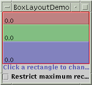
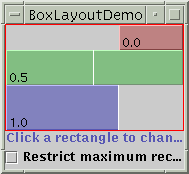
BoxLayout is the only layout manager that supports alignment and maximum size.
To bring into effect the changes on a component to the container hierarchy call revalidate() method of the component. To show the change on the component call the repaint() method on the component. Both of this 2 methods are thread-safe.
When a BoxLayout lays out components from top
to bottom, it tries to size each component at the
component's preferred height. If the amount
of vertical space is not ideal, the box layout tries to adjust each
components' height so that the components
fill the available amount of space. However, the components
might not fit exactly, since BoxLayout respects
each component's requested minimum and maximum
heights. Any extra space appears at the bottom
of the container.
A top-to-bottom box layout tries to make all
of its container's components equally wide -- as wide as the
largest preferred width. If the container
is forced to be wider than that, then the box layout tries to make all
the components as wide as the container. If
the components aren't all the same width (due to restricted
maximum size or to any of them having strict
left or right alignment), then X alignment comes into play.
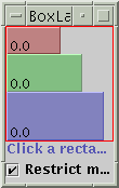
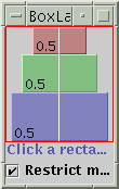
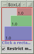
Restricted maximum size and same X alignment: (LEFT, CENTER, RIGHT)
Restricted Maximum size and different alignment:
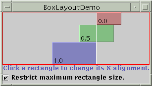
No Maximun size restriction but same X alignment : All components are as wide as the container
No Maximum Size and different X alignment: One with intermediate alignment is as wide as the container
Invisible Components as Fillers:
Provided by Box or Border.
Rigid Area:
Use this when you want a fixed-size space between two components. For
example, to put 5 pixels between two components in a left-to-right
box, you can use this code:
container.add(firstComponent);
container.add(Box.createRigidArea(new Dimension(5,0)));
container.add(secondComponent);
Glue:
Use to specify where the extra space in the Layout should go. The following
makes 2 components in left-to-right Boxlayout as far apart as possible:
container.add(firstComponent);
container.add(Box.createHorizontalGlue());
container.add(secondComponent);
Box.Filler:
Use this to specify a component with whatever minimum, preferred, and
maximum sizes you want. For example, to create some filler in a left-to-right
layout that puts at least 5 pixels between two components and ensures
that the container has a minimum height of 100 pixels, you could use this
code:
container.add(firstComponent);
Dimension minSize = new Dimension(5, 100);
Dimension prefSize = new Dimension(5, 100);
Dimension maxSize = new Dimension(Short.MAX_VALUE, 100);
container.add(new Box.Filler(minSize, prefSize, maxSize));
container.add(secondComponent);
Alignment Problem:
* A group of Buttons laid out left-to-right have their centers aligned
by default. To make their bottoms align use the following code:
button1.setAlignmentY(Component.BOTTOM_ALIGNMENT);
button2.setAlignmentY(Component.BOTTOM_ALIGNMENT);
gridx, gridy
Specify the
row and column at the upper left of the component. The leftmost column
has address
gridx=0 and
the top row has address gridy=0. Use GridBagConstraints.RELATIVE (the
default value)
to specify that the component be placed just to the right of (for gridx)
or just below
(for gridy)
the component that was added to the container just before this component
was added.
We recommend
specifying the gridx and gridy values for each component; this tends to
result in
more predictable
layouts.
gridwidth, gridheight
Specify the
number of columns (for gridwidth) or rows (for gridheight) in the component's
display area.
These constraints specify the number of cells the component uses, not the
number of
pixels it uses.
The default value is 1. Use GridBagConstraints.REMAINDER to specify that
the
component be
the last one in its row (for gridwidth) or column (for gridheight). Use
GridBagConstraints.RELATIVE
to specify that the component be the next to last one in its row
(for gridwidth)
or column (for gridheight).
Note: GridBagLayout
doesn't allow components to span multiple rows unless the component is
in
the leftmost
column or you've specified positive gridx and gridy values for the component.
fill
Used when the
component's display area is larger than the component's requested size
to determine
whether and
how to resize the component. Valid values (defined as GridBagConstraints
constants) are
NONE (the default), HORIZONTAL (make the component wide enough to fill
its display
area horizontally,
but don't change its height), VERTICAL (make the component tall enough
to fill its
display area
vertically, but don't change its width), and BOTH (make the component fill
its display
area entirely).
ipadx, ipady
Specifies the
internal padding: how much to add to the minimum size of the component.
The default
value is zero.
The width of the component will be at least its minimum width plus ipadx*2
pixels,
since the padding
applies to both sides of the component. Similarly, the height of the component
will
be at least
its minimum height plus ipady*2 pixels.
insets
Specifies the
external padding of the component -- the minimum amount of space between
the
component and
the edges of its display area. The value is specified as an Insets object.
By
default, each
component has no external padding.
anchor
Used when the
component is smaller than its display area to determine where (within the
area) to
place the component.
Valid values (defined as GridBagConstraints constants) are CENTER (the
default), NORTH,
NORTHEAST, EAST, SOUTHEAST, SOUTH, SOUTHWEST, WEST, and
NORTHWEST.
weightx, weighty
Specifying weights
is an art that can have a significant impact on the appearance of the components
a
GridBagLayout
controls. Weights are used to determine how to distribute space among columns
(weightx) and
among rows (weighty); this is important for specifying resizing behavior.
Unless you specify
at least one nonzero value for weightx or weighty, all the components clump
together in
the center of their container. This is because when the weight is 0.0 (the
default), the
GridBagLayout
puts any extra space between its grid of cells and the edges of the container.
Generally weights
are specified with 0.0 and 1.0 as the extremes: the numbers in between
are used
as necessary.
Larger numbers indicate that the component's row or column should get more
space.
For each column,
the weight is related to the highest weightx specified for a component
within that
column, with
each multicolumn component's weight being split somehow between the columns
the
component is
in. Similarly, each row's weight is related to the highest weighty specified
for a
component within
that row. Extra space tends to go toward the rightmost column and bottom
row.